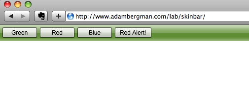
Yesterday, I wanted to get a feel for how skinning was changing in the new Flex 4 framework. I thought Catalyst was going to be the best route, but after staring at a blank artboard in Illustrator for a few minutes I decided it might be good to just code some things by hand see what materialized. I checked out the documentation and thought an easy exercise in skinning would be to recreate the old ApplicationControlBar in the Flex 2/3 framework. This seemed like a good job for SkinnableContainer. A step by step is available after the jump.
View the Project in Action
Explore the Source Code
Step By Step Explanation

Step 1: Photoshop
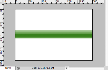
I knew that I wanted to be able to change the bar’s color, and that I wanted that to animate with the AnimateColor transition. I also knew that I wanted the bar to have a glossy feel to it. So, I fired up Photoshop and mocked up my new application bar:

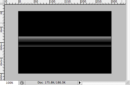
I added the highlights on separate layers so I could isolate them, create a pattern and then use them in a BitmapFill on the skin of my bar. Below is a screenshot of the highlight pattern on a black background:

I exported my highlights with no background layer to a PNG file (to preserve the transparency) and fired up Flash Builder 4 Beta.
MXML Application in Flash Builder
First I created a new project called “SkinBar” and dropped a SkinnableContainer on to the blank canvas (MXML below):
-
<s:Application xmlns:fx="http://ns.adobe.com/mxml/2009"
-
xmlns:s="library://ns.adobe.com/flex/spark"
-
xmlns:mx="library://ns.adobe.com/flex/halo">
-
<s:SkinnableContainer height="33" left="0" right="0" top="0" id="bar">
-
</s:SkinnableContainer>
-
</s:Application>
Creating a Skin
The background skin of my SkinnableContainer would include two rectangles, the bottom-most would have a standard SolidColor fill and the top-most rectangle would have a BitmapFill that used my highlights image as a pattern. I want the background rectangle to be able to switch between green, red and blue. First, I create a new MXML Component and base it on the Skin component. I call it “ApplicationBarBackground”:
-
<?xml version="1.0" encoding="utf-8"?>
-
<s:Skin xmlns:fx="http://ns.adobe.com/mxml/2009"
-
xmlns:s="library://ns.adobe.com/flex/spark"
-
xmlns:mx="library://ns.adobe.com/flex/halo"
-
height="33">
-
<fx:Metadata>
-
[HostComponent("spark.components.SkinnableContainer")]
-
</fx:Metadata>
-
<s:states>
-
<s:State name="normal" />
-
<s:State name="disabled" />
-
</s:states>
-
<s:layout>
-
<s:BasicLayout/>
-
</s:layout>
-
<s:Group id="contentGroup" left="5" right="5" top="5" bottom="5">
-
<s:layout>
-
<s:HorizontalLayout/>
-
</s:layout>
-
</s:Group>
-
</s:Skin>
The component starts out with the <fx:Metadata> tag. This tag tells the compiler which component type the skin is used with. The tag is very important in that it gives us the ability to call back to the root component’s data/model from our skin class. Most of the time you wouldn’t need this functionality because things like disabled/enabled, selected/not are handled with states.
The SkinnableContainer component requires at least two specific states to be implemented in the Skin, “normal” and “disabled”. If you try to compile the Skin without these two states the compiler will throw an error. Beyond the states required by the component you are skinning you can specify other, custom states. We’ll look at this in a bit.
After the <s:states> tag comes the <s:layout> tag. This property specifies how the SkinnableContainer component will display its children. BasicLayout works fine here because I will be manually setting the position of the children.
Finally, you see the <s:Group> tag which is the actual container for components that are added to the SkinnableContainer using the addChild() or addChildAt() methods. A container is required here and it must be named “contentGroup”. Not including this will result in a compiler error. Because I want the container to behave like the ApplicationControlBar I have told the group to use a HorizontalLayout.
Adding Custom Graphical Elements
We currently have a good skeleton of a skin going, it complies with the structure for a SkinnableContainer. Now, we have to customize it. I’ll do that by first adding my visual elements: two rectangles, one a solid color, the other my highlight pattern.
-
<s:Rect height="33" top="0" right="0" left="0">
-
<s:fill>
-
<mx:SolidColor id="barColor" color="0x608e34" />
-
</s:fill>
-
</s:Rect>
-
<s:Rect height="33" top="0" right="0" left="0">
-
<s:fill>
-
<s:BitmapFill source="@Embed(‘bar_highlight.png’)"/>
-
</s:fill>
-
</s:Rect>
In MXML, the top most component in the MXML syntax is rendered first and therefore “below” other components that come after it in MXML syntax. First, we create a rectangle and set its fill to a solid color. Notice that an id of “barColor” is given to the fill so that we can animate its properties during transitions. The second <s:Rect> tag has the same dimensions as the first, however it contains a BitmapFill which will repeat the highlight pattern I created in Photoshop earlier.
Declaring the Skin in your Application
The last thing you must do to use a new skin is to set the skinClass property on your SkinnableContainer. You can do this by either setting the property on the instance of the SkinnableContainer in the MXML:
-
<s:SkinnableContainer height="33" left="0" right="0" top="0" skinClass="ApplicationBarBackground" id="bar">
If you would like this skin to apply to all SkinnableContainers in your application you could create a style:
-
<fx:Style>
-
@namespace s "library://ns.adobe.com/flex/spark";
-
-
s|SkinnableContainer {
-
skinClass: ClassReference("ApplicationBarBackground");
-
}
-
</fx:Style>
After setting your SkinnableContainer‘s skinClass property, you should be able to compile and run the application and see a nice green skin. Now we’ll add some new states and transitions.
Custom States with Animated Transitions
Three states are added to the Skin MXML: “red”, “green”, and “blue”.
-
<s:states>
-
<s:State name="normal" />
-
<s:State name="disabled" />
-
<s:State name="green" />
-
<s:State name="red" />
-
<s:State name="blue" />
-
</s:states>
The color property of our SolidFill will be modified based on the state:
-
<s:Rect height="33" top="0" right="0" left="0">
-
<s:fill>
-
<mx:SolidColor id="barColor" color.blue="0x003abc" color.green="0x608e34" color="0x608e34" color.red="0x8e3434" />
-
</s:fill>
-
</s:Rect>
Notice the multiple definitions for the color property – one for each state. The default color=”…” is used for the normal state.
This functionality can be tested by adding a Button to the main Application that switches the state of the Skin on the SkinnableContainer:
-
<s:Button x="554" y="51" label="Red" click="bar.skin.currentState=’red’;"/>
Transitions between States
To make the current color of the rectangle (inside our Skin MXML) move smoothly to the color of the state that is going to be displayed I used the AnimateColor transition:
-
<s:transitions>
-
<s:Transition fromState="*" toState="*">
-
<s:AnimateColor duration="1000" target="{barColor}" />
-
</s:Transition>
-
</s:transitions>
A duration is set to 1000 milliseconds, and the target of the animation is set to the fill of the background rectangle.
On Demand Animations
Finally, I added an animation that can be called through ActionScript:
-
<fx:Declarations>
-
<s:AnimateColor target="{barColor}" repeatBehavior="reverse" duration="520" colorTo="0xFF0000" id="flashRed" repeatCount="6" />
-
</fx:Declarations>
This animation will flash the bar red 3 times and return back to the original color. The final project can be viewed below:
View the Project in Action
Explore the Source Code

it’s awesome!
and thank you
i am getting this error
Description Resource Path Location Type
1172: Definition ApplicationBarBackground could not be found. LighthouseRed.mxml /LighthouseRed/src line 603 Flex Problem
https://trustcert.ro/2019/12/25/15808/ dating sites for older adults